MyFitnessPal: A UX Review of the iOS App
A UX Designer And Competitive Athlete Takes A Look At One Of His Favorite Training Apps
As a competitive cyclist I’m always looking for ways to improve my performance. As a UX Designer, I tend to cast a critical eye on the usability of the products with which I come in contact. Recently these two passions came together around the MyFitnessPal iOS application
MyFitnessPal (www.myfitnesspal.com) is one of my favorite mobile application training aids. The service is more than just a resource for athletes like me, it’s relevant to people of all walks of life. Never in human history has our food been so nutrient rich, inexpensive and accessible. Add to that the fact that modern life is predominantly sedentary and the inevitable result is weight gain, poor health and lower quality of life.
Our daily lives just don't have the same caloric demands as they used to.
MyFitnessPal attempts to shine a light on this imbalance to guide users to healthier eating habits with respect to their energy expenditure and health needs.
The concept is excellent – but as a UX Designer, I know sometimes even the best ideas can falter in the execution. So I put on my UX Designer thinking cap and asked participants to perform some basic tasks in the app in order to analyze the user experience
The Process
While MyFitnessPal has both web-based as well as iOS versions, I felt the iOS version was the most relevant for this exercise. To really benefit from the use of this app its’ use has to become part of your daily routine- while you’re “one the go” so to speak. Only a mobile device can address that need.
Unfortunately recording a UX test on the iPhone is a bit tricky, so my first order of business was to overcome that challenge. For more background on the challenge and my solution see my previous Medium post here.
To evaluate the efficacy of the MyFitnessPal iOS app, users were asked to demonstrate the following three tasks in the iOS application:
1. Set a Goal
2. Log a Meal
3. Check on their progress
Synthesis
Before we get to the results, a little about the process of handling all the user comments and responses. There was a lot of information, so it had to be organized. What I did was organize the information and observations based on certain criteria:
Task — The task undertaken by the user
Action —A test user action observed during the task
Click Path — The user’s path through the product’s user interface
Quotes — Anything the user said during the test
Insights — Perceptions drawn from observations during the test
Category — I created three categories based on commonalities I found during a dump and sort process.
1.) Information Relevance — Did the presentation of irrelevant information by the application cause a problem?
2.) Usability- An issue directly associated with how the user interface was designed.
3.) Feedback — Responses from the application to the user
From there, the information was sorted, categorized, and consolidated into a master log/table.
The master log of test session data.
The log was then used to create a storyboard of the test sessions.
The storyboard would serve as a static view of the information buried in the video recordings of the test sessions. The goal is to uncover pattern behavior and problem areas across all of the user tests.
The storyboard would consist of the following elements.
Elements of the Story Board
User Navigation (Green Path), Errors (Red Path) and Observations (Yellow Stickies) contribute to the Insight score. Scores are represented by the yellow and red bars. The score would indicate which issues / insights are more critical. The higher the score the more critical the issue.
Test 1: Setting a Goal
The first thing I asked testers to do was to set a goal using the MyFitnessPal application.
Click-path, quotes and insights gained from users setting a goal in the MyFitnessPal iPhone app.
The Findings
In setting a goal, users ran into some problems with the mobile application. For one thing, there was some confusion as to which tool to use to edit the data:
There are four ways to edit data in the application.
- The “+” sign is used to ADD information
- The wrench symbol is used toMODIFY the existing data
- The pencil is used to EDIT the information
- Users can also “swipe” an item
This confused many of the users as many didn’t know which method to use in each situation. (I.e. how is modify different fromedit?)
Moreover, after a change was made there was no confirmation that the change went through successfully.
“I need to validate… I don’t know where to do that.”
Suggestions
- Simplify the tools and functions for adding and modifying the information.
- Streamline the editing of the information within the modules so that users don’t have to jump from place to place to locate the area that requires the change.
- Create a clear confirmation of changes in the user interface.
Test 2: Logging a Meal
The next step was for the user to log a meal in the MyFitnessPal mobile application.
Click-path, quotes and insights gained from users logging a meal in the MyFitnessPal iPhone app.
The Findings
This is an extremely important part of the MyFitnessPal app because it is probably the most often used MyFitnessPal feature. It’s essential that the user experience be simple, quick and effortless. However, even here there were a few sticky places:
- The “Add to Diary” button wasn’t obvious to most users so many ended up taking a round-about path to log a meal. This made the process unnecessarily difficult and time consuming.
- The food search was ineffective; users struggled to find specific foods in the local and web-based food catalog.
“They don’t have the one that I ate in here”
Suggestions
- Make the “Add to Diary” button easier to use and more obvious.
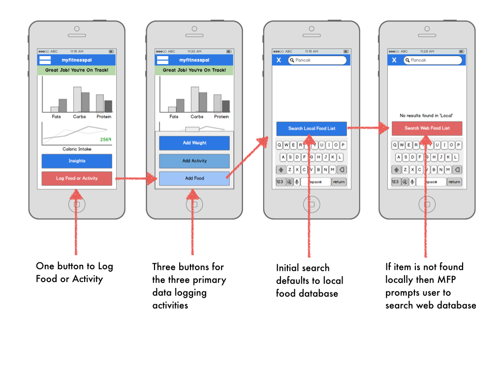
- Simplify the addition of meals and food to the Food Diary using a single button to add any kind of Diary entry.
- Create a two-step food search. Help the user understands that he/she may need to conduct a two-step search for some foods. Many users are searching locally and when they can’t find the food they are looking for don’t realize that they can then search the more comprehensive web-based food catalog.
Test 3: Checking on Progress
The final step was for users to check whether they were on track for reaching their goal.
Click-path, quotes and insights gained from users checking on progress towards a goal in the MyFitnessPal iPhone app.
The Findings
While the MyFitnessPal mobile application is packed with features and useful information, users are struggling to master the app and don’t get the full benefit of the program’s insights, guidance and motivation. For example:
- Users didn’t see the relevance of the ‘news feed’ feature
- There was no tracking of progress toward personal goals on the home screen.
- With in the Diary there was a lack of guidance from the application toward personal goals.
“The home page isn’t very motivating. Seeing my progress towards my goal is what motivates me.”
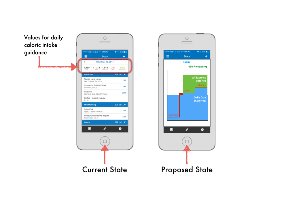
- The five caloric data values at the top of the screen (see image below) were the closest thing to daily guidance offered by the app.
- The pie charts for the percentages of proteins, fats and carbohydrates do not allow for a comparison of how planned macronutrient intake is tracking against actual intake.
Although the values are mathematically accurate, they don’t empower the user to work towards his or her goal. For example, if a user exceeds his or her caloric intake for the day, those calories are represented by a negative (-) value. This seems counterintuitive and confusing for a value that is supposed to represent a surplus of calories.
Suggestions
- To motivate the user, put their progress right on the home screen.
- Simplify the MyFitnessPal home screen to address the three primary needs of the mobile user:
1.) Logging a meal or activity
2.) Checking on progress
3.) Delivering personalized and motivating information.
- Present the daily data (goal, food intake, exercise, net, remaining) in a way that allows the user to see at-a-glance the status of their current plan (i.e. surplus, deficiencies, or right on track). I recommend a graphic representation that shows the daily goal and the adjusted daily goal based on exercise.
- Create pie charts or graphs that do allow a comparison of how the planned nutrient intake is stacking up against the actual nutrient intake.
Final Thoughts
I’m not privy to the business plan or the product roadmap at MyFitnessPal but my experience tells me that there are no doubt many reasons why the product team would not be able to directly incorporate my suggestions into their product development plans. The team at MyFitnessPal has and continues to build a robust nutrition management tool. I look forward to seeing how the team enhances the application in the next release!
Update!
During the writing of this article, The MyFitnessPal team updated the iOS application and the new layout addresses two of my concerns:
- ) The Diary is much clearer. In the previous version reviewed above, users missed the “Add to Diary” button and so struggled to log meals. In the newest version of the MyFitnessPal mobile application the MyFitnessPal team has added a large “+”sign button at the bottom/center of the screen. That plus sign button is now the primary way to add items to the Diary. Its much more conspicuous and intuitive than the previous “Add to Diary” button.
- )When the user clicks on the “+” sign button they have the ability to log not only a meal entry, but also a daily weight, status, exercise, or water intake.
These changes were a major improvement and go a long way towards lowering the cognitive load of using the MyFitnessPal iOS app.


