Building A Coaching Module for STRAVA
A solution to drive more users to the STRAVA platform

Background
STRAVA has made a big impact in the cycling and running world. Historically running and cycling were seen as solitary endeavors. However when STRAVA went live runners and cyclists the world over were suddenly given a platform on which to compete, collaborate, share, and compare their running and cycling activities. STRAVA athletes track their rides and runs via GPS enabled devices. The GPS data recorded during these activities is uploaded to STRAVA where it is analyzed and compared to every other athlete that has ever covered that same stretch of road. For STRAVA users a morning run or ride to work suddenly takes on a new dimension as they compete virtually against every other STRAVA user that has ever covered that same stretch of road. It’s fun and addicting if not awe-inspiring to see what some of the more talented athletes among us are capable of accomplishing.
It’s no wonder that STRAVA has become wildly successful.
However, the activity data (results) uploaded to STRAVA are really only half the story. The part that’s missing is the planning, strategy and hard work that went in to creating the fitness that enabled the performance

Moreover, may of the athletes turning out the top performances on STRAVA are “coached” athletes. They work with professional coaches who guide them through their daily training with the goal of optimizing performance. Most of those coached athletes are using other applications to manage their interactions with their coaches. The result is that they are forced to upload activity data to two sometimes three web-applications.
I had a hunch that there might be an opportunity for STRAVA to grow membership (and revenue) with both runners and cyclists if they could support coach and athlete interactions right in STRAVA.
But what would that integration look like?
I reached out to several STRAVA users to find out what they would want to see in a STRAVA coaching module. I then went about developing a prototype of an enhanced STRAVA application.
I called the new concept:

Here is a run-down of my process and the result.
The Process
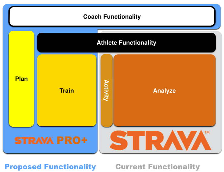
The first thing I needed to do was define the scope of this project. Through discussions with various STRAVA users I saw the opportunity to enhance the platform in a variety of ways. If taken to its logical conclusion STRAVA PRO+ would be a major undertaking as it would ideally have these additional features:
- Coach Certification
- Coach Community Manager
- eCommerce Portal w/ Coach Marketplace
- Coaches Dashboard
- Physiological Testing + Analysis Dashboard
- Training Plan Designer
- Training Plan Library Manager
- Athlete and Coach Training Plan Collaboration
For this exercise I focused on the last item in the list.
Persona
Based on the athlete interviews I produced the following persona. I made the persona subject a cyclist but many of the same issues hold true for the STRAVA runner athlete.
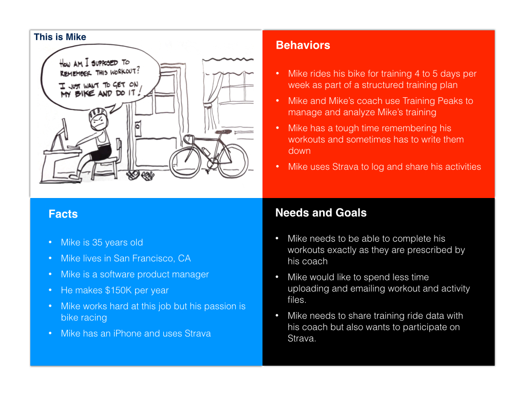
The key to understanding Mike’s frustration is that a work out is often a complex mixture of activity and rest intervals of different intensities and durations. Athletes find it difficult to remember the details of the workouts and as a results have developed their own band-aid solutions.

A Post-it note with a typical workout — brought along on a ride for reference by the athlete.
“…I can never remember my workouts! I end up texting the plan to myself so that I can check it during my ride.”
Design Stories
With some key behaviors, needs and motivators identified I set about developing several epics and supporting design stories.
User Does Prescribed Workout
- User can view Training Plan
- Users can view individual Prescribed Workout for each day
- Users can view today’s Prescribed Workout
- User begins Workout Activity
- User can pause Workout Activity
- User can restart Workout Activity
- User can finish Workout Activity
- User can restart finished Workout Activity
- User can add comments to Workout Activity
- User can Save Workout Activity
- User can Share Workout Activity
- User can review Workout Activity details / metrics / graphs
- User can choose to make the Workout Activity private
- User can delete Workout Activity
User Reviews Workout Data on iPhone
- User can view calendar
- User can view prescribed Workouts for each day
- User can view Workout Activities already logged for each day
- User can review the metrics of the Workout Activity in comparison to the prescribed Workout
- User can add comments to the Workout Activity file
- User can read comments from his coach about the Workout Activity
- User can associate a Workout Activity with a prescribed workout
- User can disassociate a Workout Activity with a Workout.
Task Flow
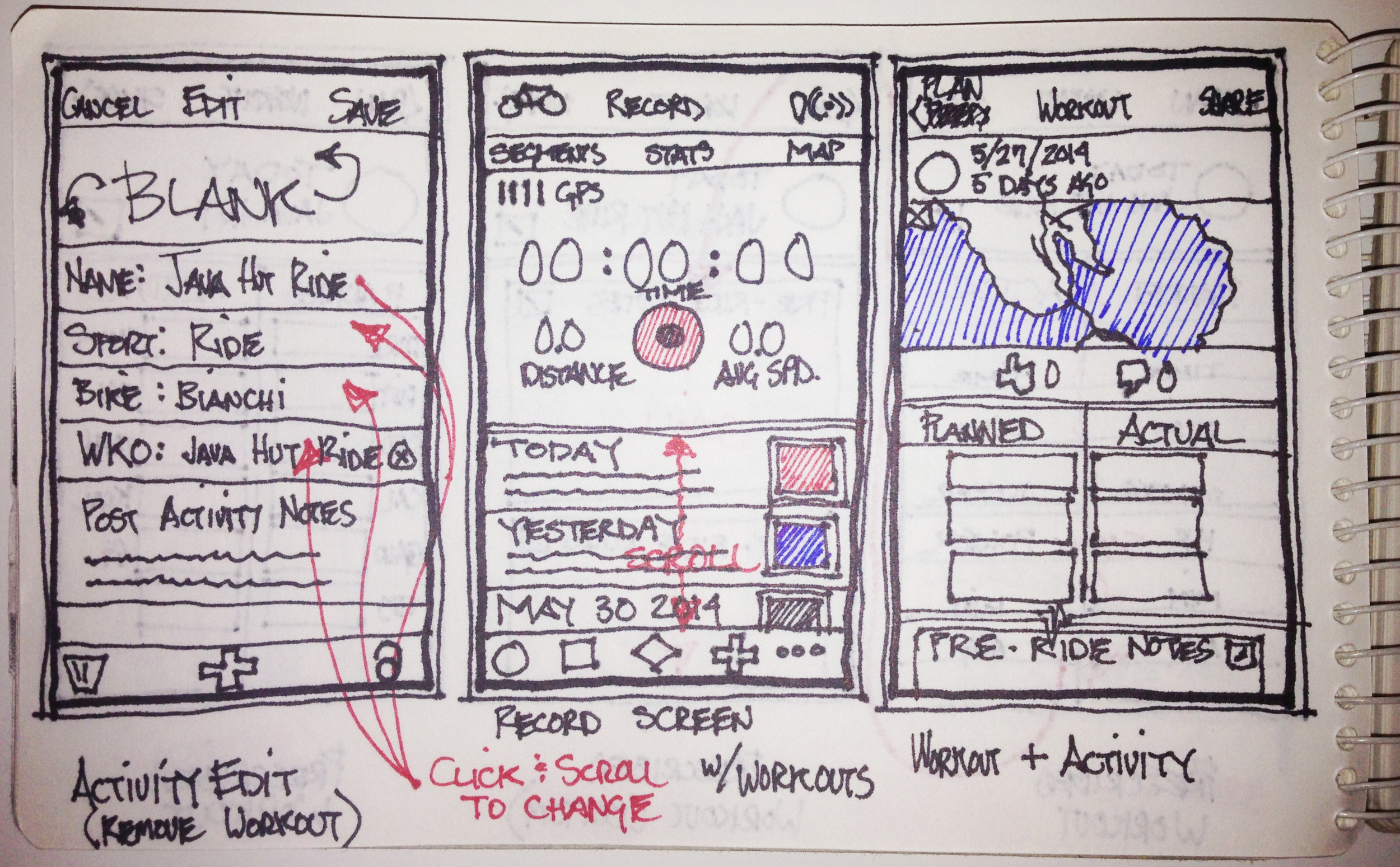
A top priority for me was to thoroughly integrate the new STRAVA PRO+ functionality into the existing task flows in the STRAVA iPhone app. The task flow was my first opportunity to explore what would be required to achieve seamless integration.
In the task flow below my proposed functionality is in ORANGE and the existing functionality is in BLUE.

Final version of the STRAVA PRO+ task flow
Due to the fact that I was designing with in an existing application the task flow had the dual characteristics of both informing and being informed by the user stories. I went through several iterations before I arrived at a solid foundation.
Sketches
Through hand sketches I explored four different design patterns for interacting with the training plan calendar and workout details in STRAVA PRO+.
- Concept 1 — Grid Calendar View
- Concept 2 — Vertical Scrolling List View
- Concept 3— Horizontal Scroll (Carousel) View
- Concept 4 — Folder View (Not Shown)
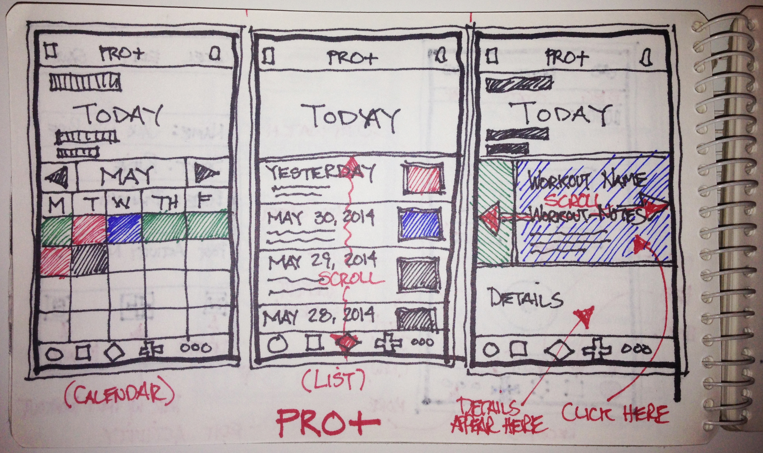
Sketches for Concepts 1, 2 and 3
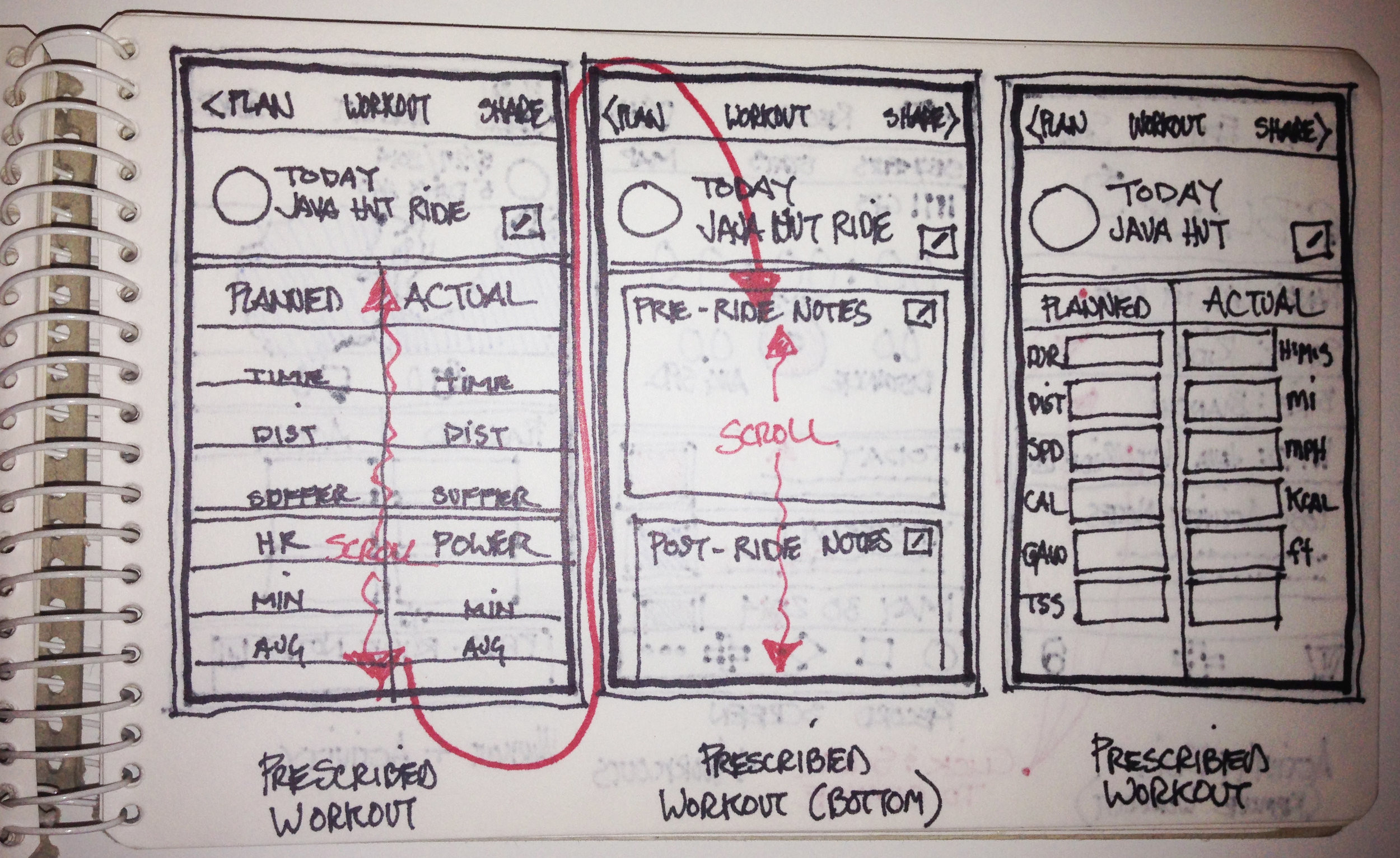
Workout Details- Scrolling to see additional notes from the coach
Viewing a completed Activity, access from the Activity Record Screen, completed work out with map.
Zeroing in on my design pattern I began to explore how the key features would be linked to existing STRAVA functionality.

Access from the existing Activity Record Screen

The final concept- Record Activity screen to Training Plan and Workout details

Workout details from the coach
A concern that I had was that activities by athletes would not match up to the workouts prescribed by the coach, so I thought about ways the athlete could manually edit / pair an activity to a workout if necessary.

Error handeling and editing
Hand sketching with pen and paper has always been a favorite part of my process. Sketching is not just a way to produce a product but also a way to explore ideas and start a dialogue.
Wireframes
With the iterative sketch process complete the wireframes went fairly quickly.

1.) Referencing a workout from the Record Activity Screen. 2.) Viewing the Training Plan

Viewing the details of a prescribed workout and viewing the details of a completed workout

Editing a completed workout
Interactive Prototype
Using Proto.io I built a near pixel perfect interactive prototype of the STRAVA PRO+ feature. I like Proto.io because it’s extremely capable and finished prototypes can be demonstrated directly on my iPhone.
Here is a 3 minute video tour of the STRAVA PRO+ prototype.
For information on how I was able to record this video on my iPhone see my earlier medium post here
Final Thoughts
When STRAVA went live runners and cyclists the world over were suddenly given a platform on which to compete, collaborate, share, and compare their running and cycling activities. Ever since then STRAVA has steadily improved the platform to deliver more value to its’ users.
One area that has not received any attention thus far is the area of coached training collaboration. If growing the user base can be done by delivering more relevant functionality to its customer athletes then integrating training plan management into STRAVA as I have described above might be one route to take
I’m not privy to the product road map at STRAVA and I have no doubt that the STRAVA product team has many new exciting developments planned for their app in the months ahead. I look forward to seeing what they do in their next release!
MyFitnessPal: A UX Review of the iOS App
A UX Designer And Competitive Athlete Takes A Look At One Of His Favorite Training Apps

As a competitive cyclist I’m always looking for ways to improve my performance. As a UX Designer, I tend to cast a critical eye on the usability of the products with which I come in contact. Recently these two passions came together around the MyFitnessPal iOS application
MyFitnessPal (www.myfitnesspal.com) is one of my favorite mobile application training aids. The service is more than just a resource for athletes like me, it’s relevant to people of all walks of life. Never in human history has our food been so nutrient rich, inexpensive and accessible. Add to that the fact that modern life is predominantly sedentary and the inevitable result is weight gain, poor health and lower quality of life.

Our daily lives just don't have the same caloric demands as they used to.
MyFitnessPal attempts to shine a light on this imbalance to guide users to healthier eating habits with respect to their energy expenditure and health needs.
The concept is excellent – but as a UX Designer, I know sometimes even the best ideas can falter in the execution. So I put on my UX Designer thinking cap and asked participants to perform some basic tasks in the app in order to analyze the user experience
The Process
While MyFitnessPal has both web-based as well as iOS versions, I felt the iOS version was the most relevant for this exercise. To really benefit from the use of this app its’ use has to become part of your daily routine- while you’re “one the go” so to speak. Only a mobile device can address that need.
Unfortunately recording a UX test on the iPhone is a bit tricky, so my first order of business was to overcome that challenge. For more background on the challenge and my solution see my previous Medium post here.
To evaluate the efficacy of the MyFitnessPal iOS app, users were asked to demonstrate the following three tasks in the iOS application:
1. Set a Goal
2. Log a Meal
3. Check on their progress
Synthesis
Before we get to the results, a little about the process of handling all the user comments and responses. There was a lot of information, so it had to be organized. What I did was organize the information and observations based on certain criteria:
Task — The task undertaken by the user
Action —A test user action observed during the task
Click Path — The user’s path through the product’s user interface
Quotes — Anything the user said during the test
Insights — Perceptions drawn from observations during the test
Category — I created three categories based on commonalities I found during a dump and sort process.
1.) Information Relevance — Did the presentation of irrelevant information by the application cause a problem?
2.) Usability- An issue directly associated with how the user interface was designed.
3.) Feedback — Responses from the application to the user
From there, the information was sorted, categorized, and consolidated into a master log/table.
The master log of test session data.
The log was then used to create a storyboard of the test sessions.
The storyboard would serve as a static view of the information buried in the video recordings of the test sessions. The goal is to uncover pattern behavior and problem areas across all of the user tests.
The storyboard would consist of the following elements.

Elements of the Story Board
User Navigation (Green Path), Errors (Red Path) and Observations (Yellow Stickies) contribute to the Insight score. Scores are represented by the yellow and red bars. The score would indicate which issues / insights are more critical. The higher the score the more critical the issue.
Test 1: Setting a Goal
The first thing I asked testers to do was to set a goal using the MyFitnessPal application.
Click-path, quotes and insights gained from users setting a goal in the MyFitnessPal iPhone app.
The Findings
In setting a goal, users ran into some problems with the mobile application. For one thing, there was some confusion as to which tool to use to edit the data:

There are four ways to edit data in the application.
- The “+” sign is used to ADD information
- The wrench symbol is used toMODIFY the existing data
- The pencil is used to EDIT the information
- Users can also “swipe” an item
This confused many of the users as many didn’t know which method to use in each situation. (I.e. how is modify different fromedit?)
Moreover, after a change was made there was no confirmation that the change went through successfully.
“I need to validate… I don’t know where to do that.”
Suggestions
- Simplify the tools and functions for adding and modifying the information.
- Streamline the editing of the information within the modules so that users don’t have to jump from place to place to locate the area that requires the change.
- Create a clear confirmation of changes in the user interface.
Test 2: Logging a Meal
The next step was for the user to log a meal in the MyFitnessPal mobile application.
Click-path, quotes and insights gained from users logging a meal in the MyFitnessPal iPhone app.
The Findings
This is an extremely important part of the MyFitnessPal app because it is probably the most often used MyFitnessPal feature. It’s essential that the user experience be simple, quick and effortless. However, even here there were a few sticky places:
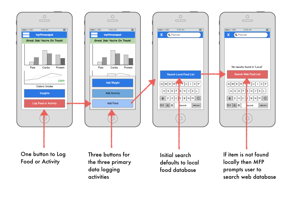
- The “Add to Diary” button wasn’t obvious to most users so many ended up taking a round-about path to log a meal. This made the process unnecessarily difficult and time consuming.
- The food search was ineffective; users struggled to find specific foods in the local and web-based food catalog.
“They don’t have the one that I ate in here”
Suggestions
- Make the “Add to Diary” button easier to use and more obvious.
- Simplify the addition of meals and food to the Food Diary using a single button to add any kind of Diary entry.
- Create a two-step food search. Help the user understands that he/she may need to conduct a two-step search for some foods. Many users are searching locally and when they can’t find the food they are looking for don’t realize that they can then search the more comprehensive web-based food catalog.
Test 3: Checking on Progress
The final step was for users to check whether they were on track for reaching their goal.
Click-path, quotes and insights gained from users checking on progress towards a goal in the MyFitnessPal iPhone app.
The Findings
While the MyFitnessPal mobile application is packed with features and useful information, users are struggling to master the app and don’t get the full benefit of the program’s insights, guidance and motivation. For example:
- Users didn’t see the relevance of the ‘news feed’ feature
- There was no tracking of progress toward personal goals on the home screen.
- With in the Diary there was a lack of guidance from the application toward personal goals.
“The home page isn’t very motivating. Seeing my progress towards my goal is what motivates me.”
- The five caloric data values at the top of the screen (see image below) were the closest thing to daily guidance offered by the app.
- The pie charts for the percentages of proteins, fats and carbohydrates do not allow for a comparison of how planned macronutrient intake is tracking against actual intake.

Although the values are mathematically accurate, they don’t empower the user to work towards his or her goal. For example, if a user exceeds his or her caloric intake for the day, those calories are represented by a negative (-) value. This seems counterintuitive and confusing for a value that is supposed to represent a surplus of calories.
Suggestions
- To motivate the user, put their progress right on the home screen.
- Simplify the MyFitnessPal home screen to address the three primary needs of the mobile user:
1.) Logging a meal or activity
2.) Checking on progress
3.) Delivering personalized and motivating information.
- Present the daily data (goal, food intake, exercise, net, remaining) in a way that allows the user to see at-a-glance the status of their current plan (i.e. surplus, deficiencies, or right on track). I recommend a graphic representation that shows the daily goal and the adjusted daily goal based on exercise.
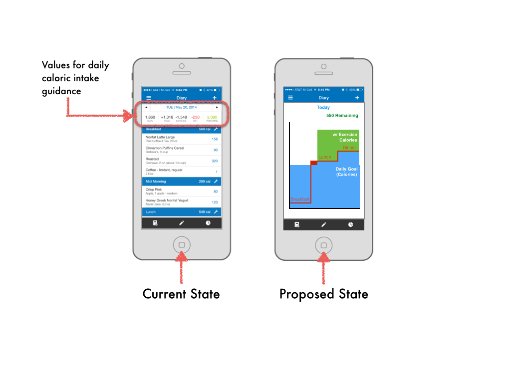
- Create pie charts or graphs that do allow a comparison of how the planned nutrient intake is stacking up against the actual nutrient intake.

Final Thoughts
I’m not privy to the business plan or the product roadmap at MyFitnessPal but my experience tells me that there are no doubt many reasons why the product team would not be able to directly incorporate my suggestions into their product development plans. The team at MyFitnessPal has and continues to build a robust nutrition management tool. I look forward to seeing how the team enhances the application in the next release!
Update!
During the writing of this article, The MyFitnessPal team updated the iOS application and the new layout addresses two of my concerns:
- ) The Diary is much clearer. In the previous version reviewed above, users missed the “Add to Diary” button and so struggled to log meals. In the newest version of the MyFitnessPal mobile application the MyFitnessPal team has added a large “+”sign button at the bottom/center of the screen. That plus sign button is now the primary way to add items to the Diary. Its much more conspicuous and intuitive than the previous “Add to Diary” button.
- )When the user clicks on the “+” sign button they have the ability to log not only a meal entry, but also a daily weight, status, exercise, or water intake.
These changes were a major improvement and go a long way towards lowering the cognitive load of using the MyFitnessPal iOS app.
A big thanks to the MyFitnessPal team!
Mobile Application UX Testing on the iPhone
Beyond Rigs & Sleds
The Future of Personal Computing is Mobile
We’ve known for a long time that the future of personal computing was mobile. Today, with mobile device sales outpacing laptop and desktop sales by a wide margin that future is here and now.

This paradigm shift has prompted many companies to adopt a “mobile first” strategy- developing mobile applications before or even in-lieu of desktop applications. So it follows that mobile application UX design and testing is and will continue to be critically important.
For a UX designer, the big challenge is how to run and record a UX test of an iOS application on an iPhone. In the PC environment, there are numerous inexpensive applications that can record screen activity. Such is not the case on the iOS platform. Apple doesn’t allow applications in the iOS environment to record screen activity on the device. The absence of this option on the iOS platform makes capturing all of the details of a UX test on the iPhone seem all but impossible.
One Solution — Rigs and Sleds
Several creative UX professionals have designed and built devices to address this problem. These solutions, sometimes referred to as “rigs” or “sleds”, are usually comprised of an armature onto which is mounted the iPhone, several cameras and a microphone. The rig is then connected to a laptop to record the session
Here are two examples of these “DIY” solutions.

If a DIY solution isn’t your style then several vendor can sell you a fully realized premium version of these rigs. Products like Mr Tappy, the Mod1000 and Wolfvision are beautiful solutions but cost hundreds of dollars.

The problem with going this route is that these rigs are a bit unwieldy. The awkwardness will undoubtedly affect the way the user interacts with the iPhone — and that’s going to impact the results of the UX test. Moreover, as a lean UX professional you may not have the budget nor the interest in attempting to incorporate one of these armatures into a guerrilla UX testing expedition. Nothing will kill a guerrilla UX test moment better than presenting your newly recruited test user with an iPhone that has sprouted arms, cameras, microphones and wires.

A Better Solution — Display Recorder
When it came time for me to do some mobile UX testing I was determined to find a better way. After a few hours of research I found an application called Display Recorder.

Display Recorder turns your iPhone into a compact, self-sufficient mobile UX testing platform. It records the user’s voice over the iPhone microphone, while simultaneously capturing all of the activity on the iPhone screen. The user’s gestures, taps, and touch points are also shown as an animation on the screen. When the test is completed, Display Recorder will turn the recording into a video file which can be viewed right on the iPhone or exported wirelessly.
The result will look something like this…
This all makes the Display Recorder a pretty effective solution for guerrilla UX testing. So why isn’t Display Recorder the de-facto standard? The reason is that Display Recorder isn’t an approved iOS application, so it’s not available in the Apple App store. Although initially approved by Apple, Display Recorder’s approval status was subsequently revoked. Apple pulled it because it works by recording user activity, which violates their developer security guidelines. – its also exactly what is needed to effectively record a UX test session.
So if you want to use Display Recorder you’ll have to jailbreak your iPhone. Granted not everyone is willing to do this. However, if you already run a jailbroken iPhone or you’re willing to invest the 10 minutes required to jailbreak your phone, then you have the opportunity to turn your iPhone into the ultimate guerrilla UX test platform.
Display Recorder isn’t just great for UX testing. Spend some time with this app and you will quickly realize it has a great many other uses. For example I’ve used Display Recorder to record product demonstrations and short “how to” videos.
My Mobile UX Testing Quiver
Pro Tip: If you decide to use Display Recorder, I suggest that you use the iPhone’s native Voice Memo application for recording pre- or post-test interviews. While it’s tempting to use Display Recorder to record everything because it’s convenient having the entire test recorded in one file, it can take up a lot of space. Although files can be moved immediately after the completion of a test, you probably want to avoid the possibility of running out of space on your phone in the middle of a test session.

My Mobile UX testing quiver. Display Recorder, Voice Memo and Proto.io
To make the tests run more efficiently I put all of my UX testing apps together into a group on my iPhone. Grouping the applications together makes jumping from app to app much quicker.
That’s it! You’re all set to run UX tests on your iPhone… no sled, rigs, or extra cameras required to capture all of the insights!
Final Thoughts
So with mobile becoming our primary personal computing platform, mobile application UX design and testing is more important than ever. If you want a simple way to run and record a UX test directly on your phone, I suggest jailbreaking your phone and using the iPhone application Display Recorder. The Display Recorder can capture all aspects of the UX test session without the need to use additional cameras and microphones. Because the test doesn’t rely on attaching additional infrastructure to the iPhone, the user’s interaction with the phone will be more natural — and the more natural the interaction, the better and truer the UX test results.
I hope that you found this helpful.
Thanks for reading and happy testing!

The Elements Of User Experience - User Experience for the Web and Beyond
I picked up a copy of The Elements of User Experience - User Experience for the Web and Beyond by Jesse James Garret.

Three things really jumped out at me.
1.) Over all my response to reading Jesse’s book was one of vindication. Earlier in my career during my tenure as a product manager I had to create and defend methodologies for strategy, scope definition, UI design, and iterative product refinement. With no formal training I did what seemed logical. Adding to the challenge was the necessity to navigate a complex organizational structure, deliver on a quarterly release cycle, and manage an offshore development team. I think that it’s dealing with these “soft” challenges are the most difficult.
Mr James offers cogent advice. When facing challenges around product or release scope the author holds up the importance of the strategy as the foundation upon which every layer of the product is to be defined and built. This is particularly challenging when emotions get the best of product stakeholders. Its nothing personal… but all decisions about whats in or out needs to be based on strategy.

2.) The foundation of Jesse James’s philosophy is to look at application design as a five tiered structure consisting of: Strategy, Scope Structure, Skeleton, Surface. As I’ve been formally trained in Architecture this concept really resonated with me. My philosophy and the way that I was taught to practice architecture was that the design of space and structure is the result of a rigorous analysis of the environment, history, culture, and expected use patterns of the project. The design of the elements of the building, ie, program, structure, mechanical systems, and enclosure are a solution to the site and program analysis. An almost direct correlation can be made between these architectural elements and the Elements of User Experience proposed by Jesse James.
3.) The categorization of all products into either Product as Functionality or Product as Information was interesting. Jesse James believes that both types of products would utilize the same five tiers of Strategy, Scope, Structure, Skeleton, and Surface, however each tier takes on special characteristics based on which of the two product categories are in play. Having never worked in content publishing before it was helpful to see Jesse compare and contrast the two.